
UX/UI Project
Enhancing Usability of Vessel Tracking Map
Goals: Identify opportunities for WCAG compliance and define new styling to improve accessibility and address poor contrast feedback in the maps.
Improve usability and accessibility of vessel tracking maps
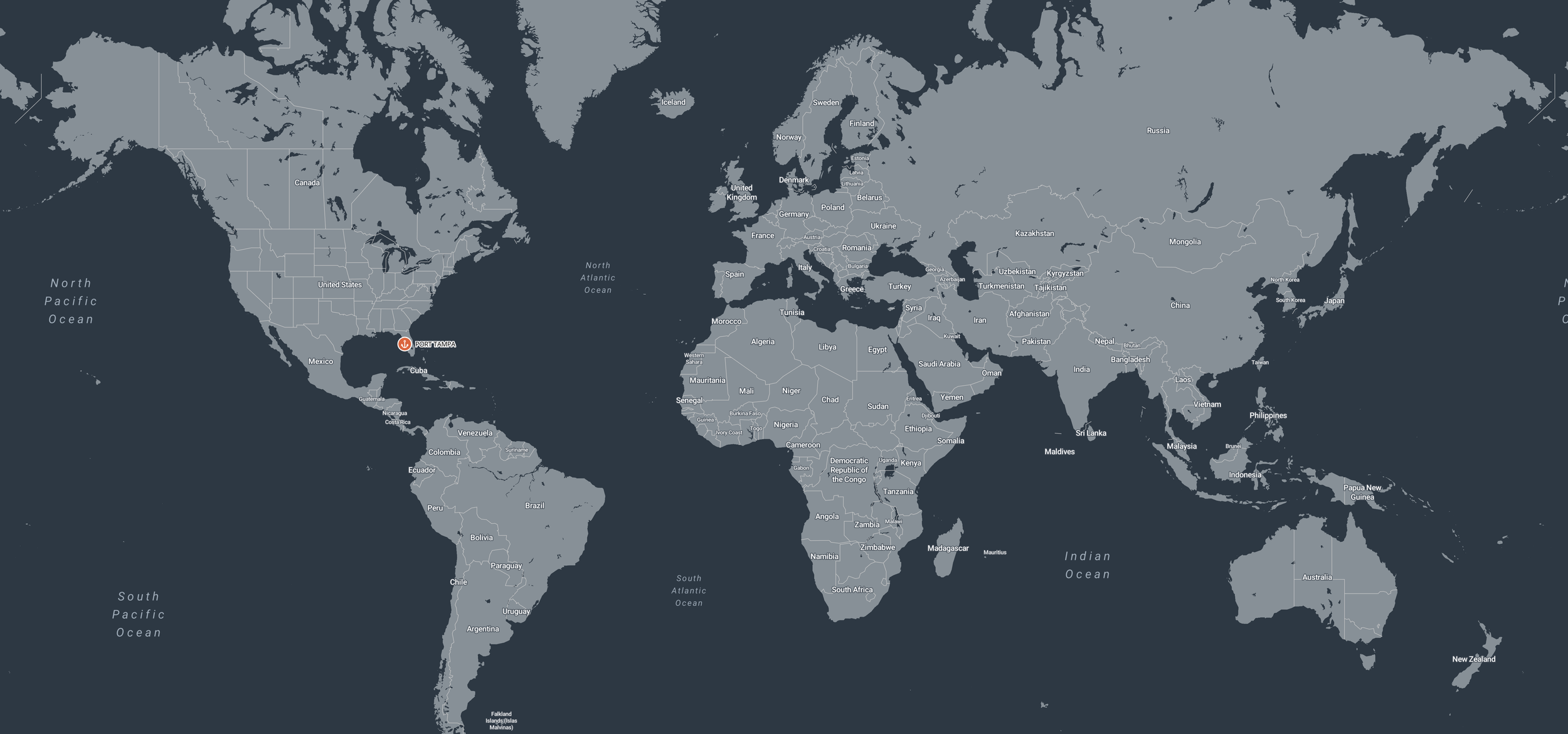
Veson Nautical is an an industry-leading commercial maritime software platform for global buyers and sellers of marine freight. The platform has several types of maps primarily used for tracking vessels.
This project emerged as a part of a larger research initiative investigating the use cases of existing maps in the software. The original map design was not WCAG compliant and we had received a lot of feedback regarding challenging contrast issues that impacted the map’s usability.
Background and Objectives
My Role
UX Designer & Project Lead
Observational user research and baseline usability research
Understand current map usage to define core use cases
Ask users to attempt to complete different tasks to test hypotheses around feature discoverability and general usability
Identify most important features and opportunities for improvement
Create a restyling plan to address WCAG compliance and usability challenges
Meet or exceed compliance standards for contrast and color-blind safety
Address visual feedback from users
Competitive analysis of other marine software maps
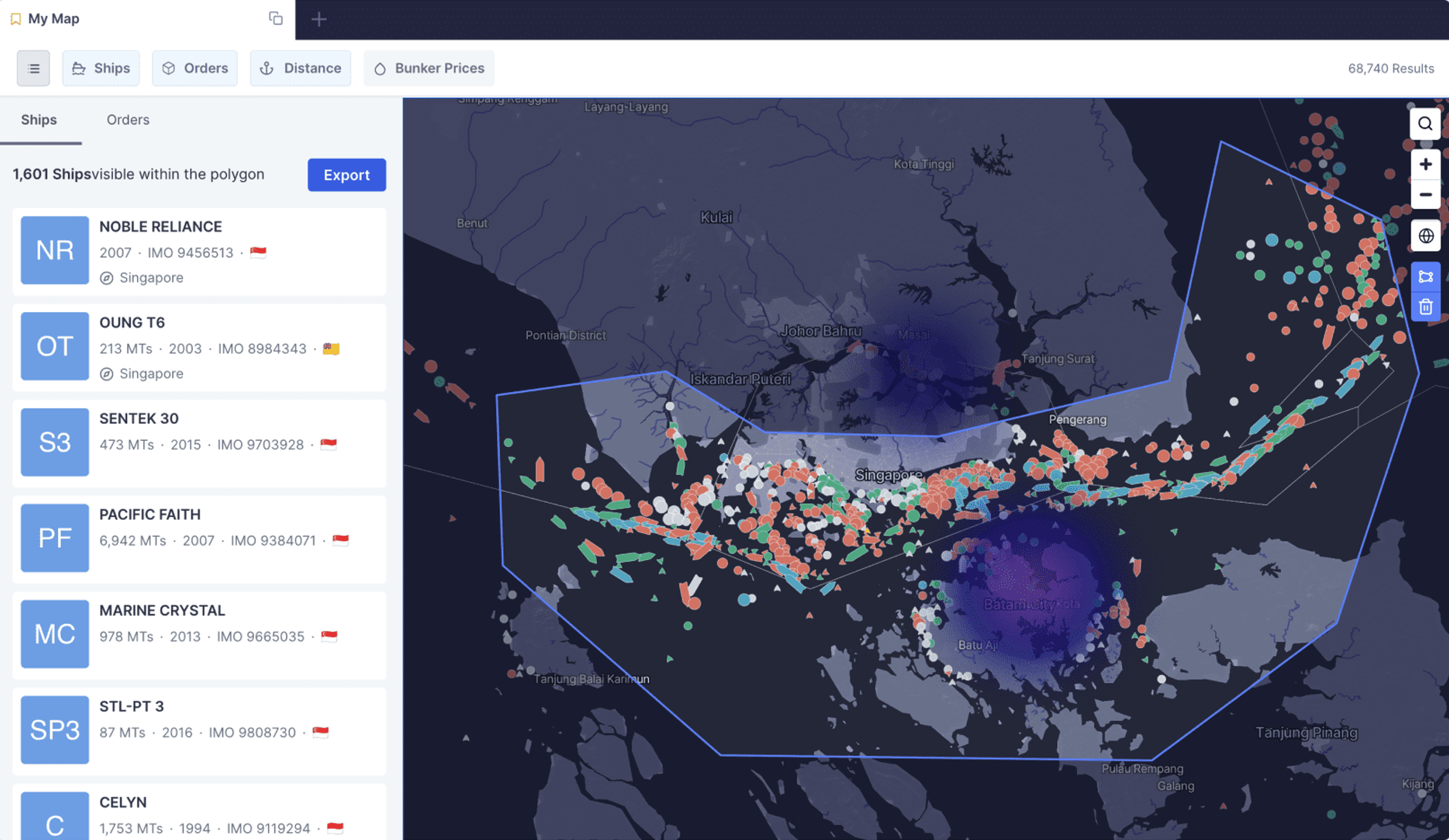
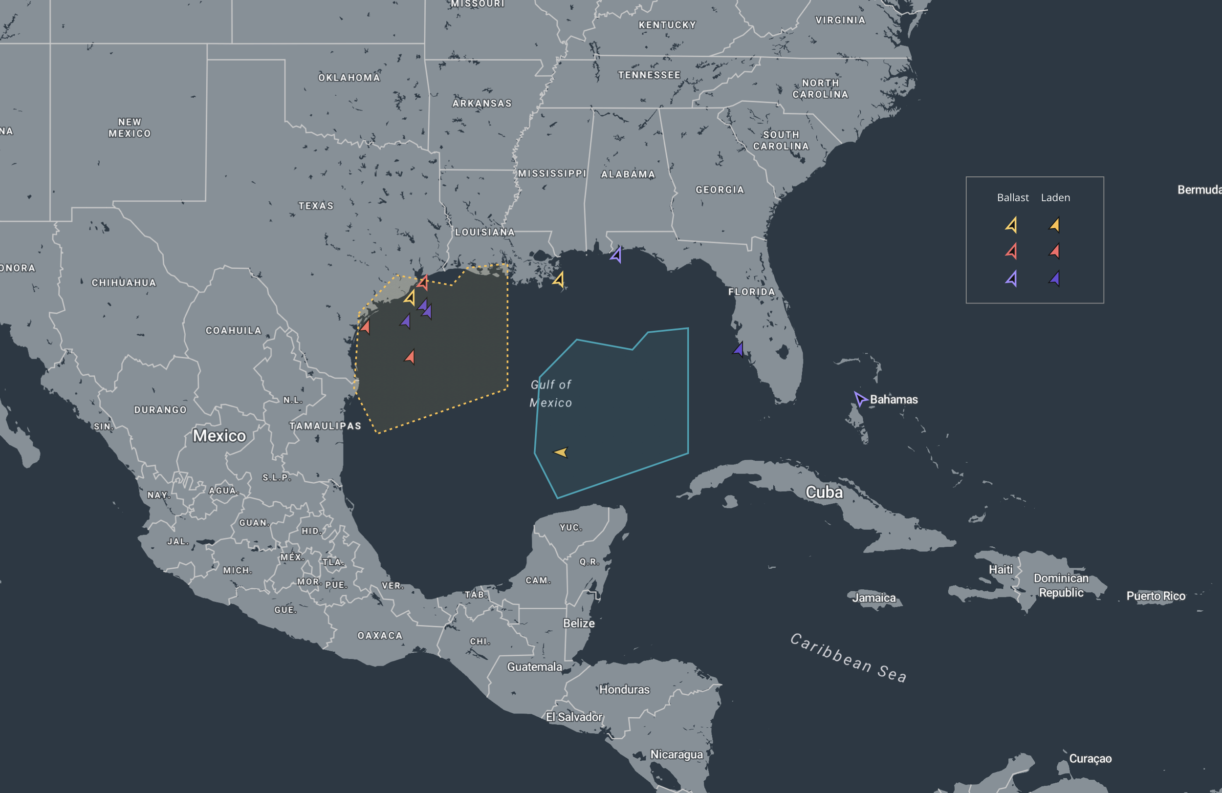
Map Restyling
Starting Point
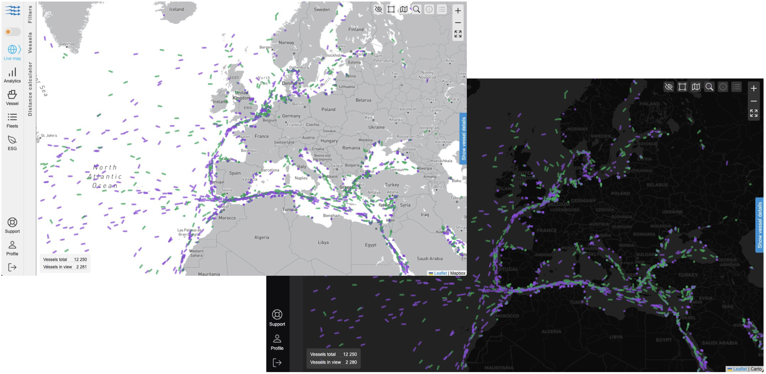
The restyling work began by working with engineers to understand how the map was implemented. The primary styling for these maps was done in Mapbox Studio with custom elements added in the code.
At a baseline, the challenges included:
Contrast challenges with semi-transparent icons overlaid on water - Especially true for map that used blue icons for the vessels
Colors are not accessible, not color-blind safe
Blue hue of the water makes it difficult to select distinguishable colors for on-map icons
Balancing “when” the information appears on zoom levels
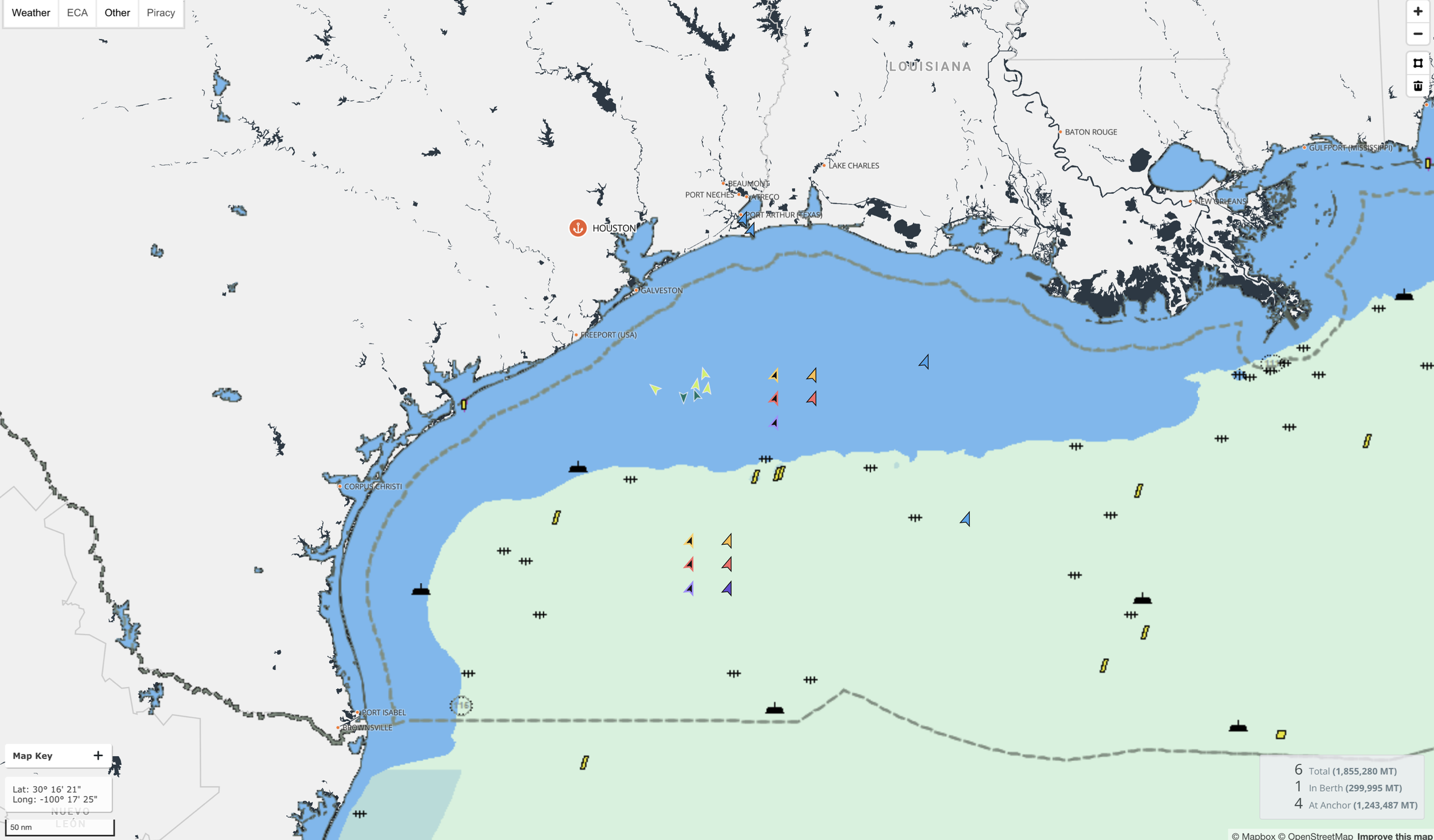
Original styling of maps
Visual Research
Exploring common patterns and features of existing maritime commerce maps

Signal Ocean
Oceanbolt
ShipFix
Exploring Accessible Color Palettes
Using the Stark accessibility tool, I tested many of our core palette and extended palette colors exploring options for new map colors with accessible contrast.
Options were tested across different base map (water and land) colors and various map overlays (weather, ECA zones, etc.)
Outcomes
After successful testing with users, the map styling changes were implemented and have received ongoing positive feedback.
The team was able to uncover and address several small bugs and strange behaviors in the UI.
The two most frequently used maps in the product are now operating from the same Mapbox styling, providing a more consistent experience.
Usage of the maps continues to increase. Users are discovering tools and features previously “hidden.” Users also provided great feedback for product opportunities relating to the maps.